 In preparations towards announcing a new project, the first impression a viewer gets is visual. The announcement is set out by means of a poster, which captures your attention and sets the ball rolling. Images are shared across the social media network. People across the world and those who do not get an opportunity to attend a performance, know the work through its image. The design is therefore the essential visual identity of a performance. And we take it very seriously.

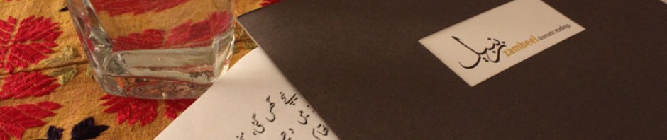
While we often elaborate on the performative mechanisms of our works; the actors, the content, the authors to name a few, we rarely discuss the process that gives the poster its final shape. A discussion on this cannot be complete without the mention of Naheed Zahra Yahya, a dear friend, designer and Associate Professor at the Indus Valley School of Art and Architecture. Like many of our friends who stepped forward to support our venture from the first day, Naheed took on the charge of giving Zambeel its design identity.
 The process began with Muzzumil Ruheel’s calligraphy of the word Zambeel, masterfully penned in the Sulus script. This was then integrated with the title by Naheed to give the Zambeel logo its final shape. It is the calligraphy that now recurs in all our posters as a watermark or in many cases, elements of the design itself.

For every performance we identify a colour that reflects the mood of the content. Each poster then becomes an amalgamation of text, colour, shapes and forms to create the final product. Drafts are set out, numerous options are discussed on Skype screen share to arrive at a consensus. During this time Naheed’s desktop takes on the appearance of a quagmire of files; alternatives for fonts and colour, scale and resolution. Negotiating through this sea, she meticulously crafts the image, often while battling other deadlines and commitments only to deliver the product on time.
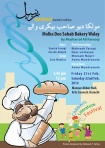
 While Zambeel’s design sensibility is abstract in nature and does not rely on the illustrative representation of its story content, the posters do employ the use of elements to illustrate with a more playful approach. Take for instance the poster of Taqseem, where the laam from the Urdu script is used to create a fence or divider, illuminating Manto’s stories on Partition. Or the Taaos Chaman ki Mayna poster where the geometric trellis suggests the design of the eejaadi qafas. In Shatranj ki Baazi, the dot motif from the Urdu script is rotated to suggest the chessboard and in Molka Deo Sahib Bakery Walay the alphabet zay is repeated to create the aromatic cloud of fumes from the bakery.


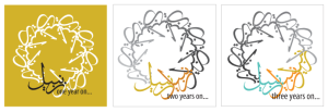
Zambeel’s design sensibility is also extended in other areas. You may have noticed the Anniversary logo that appears annually on our web pages. This is a circular motif created with nine repetitions of the calligraphic text. While the ‘One year on’ logo highlights one central motif in black to signify the first anniversary, the ‘Two years on’ design is slightly altered to mark two coloured motifs integrated with a monochromatic gradation in the remaining circle. Cleverly conceived, the concept is built around its adaptability as we move from one year to the next. This design is extended in our annual bookmarks as well as our Facebook header image.
Suffice to say, it is a laborious task and one that Naheed Yahya has fulfilled beyond our expectations. Across the seas where our voices don’t reach, it is these visual artefacts that represent Zambeel’s work to the world.
CLICK HERE to visit the updated Zambeel Design Page.
CLICK ON THE FIRST THUMBNAIL to view the album on Zambeel Posters.
-

- 01a
-

- 01b
-

- 02a
-

- 02b
-

- 03
-

- 04
-

- 05a
-

- 05b
-

- 06
-

- 07
-

- 08
-

- 09
-

- 10
-

- 11
-

- 12
-

- 13
-

- 14
-

- 15
-

- 16
-

- 17
-

- 18
